

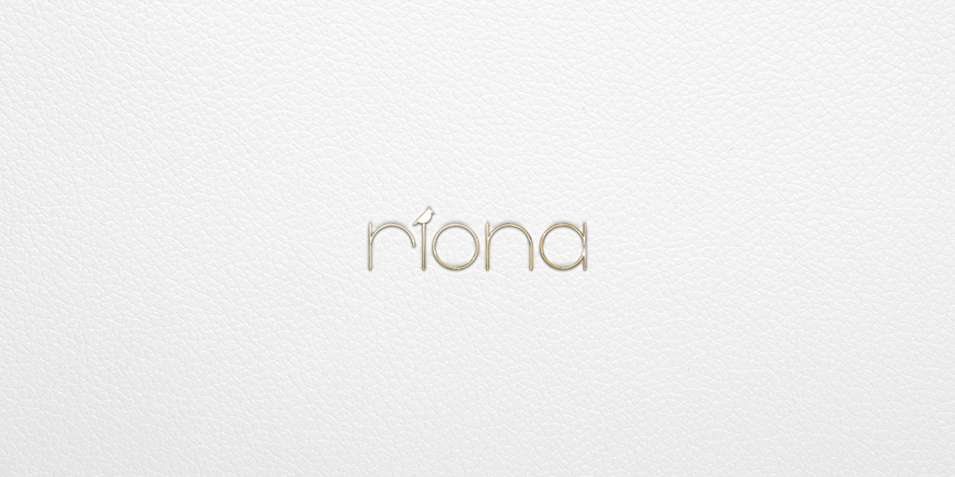


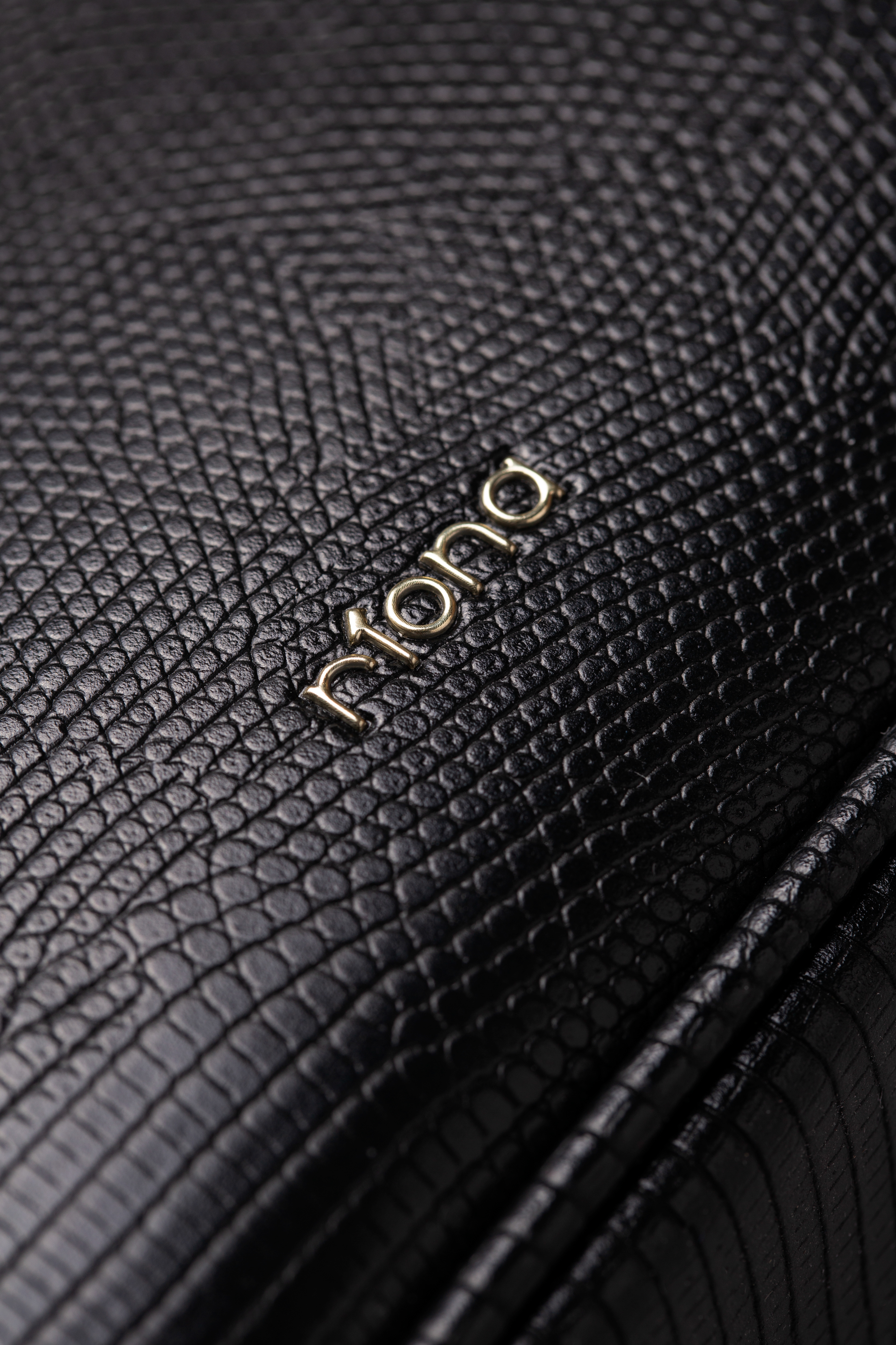
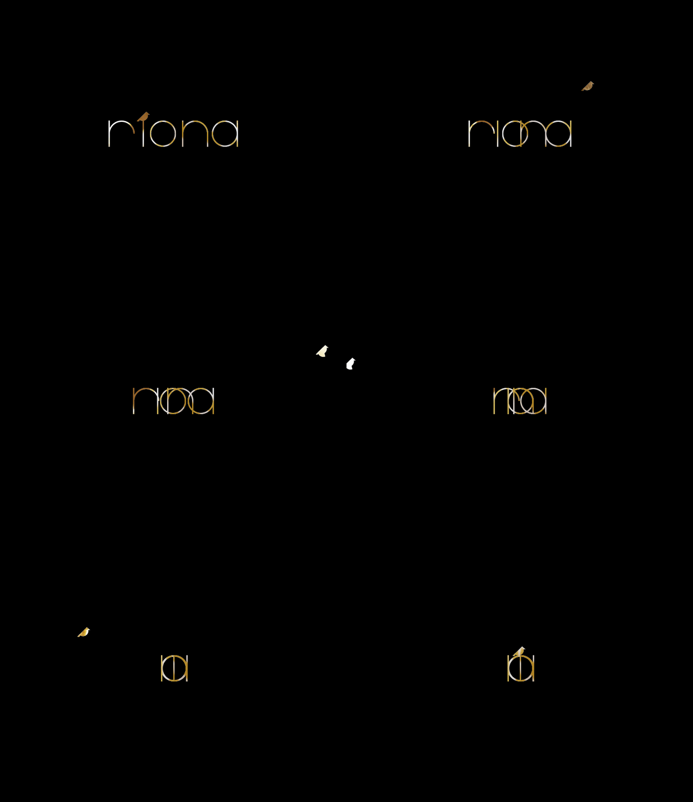
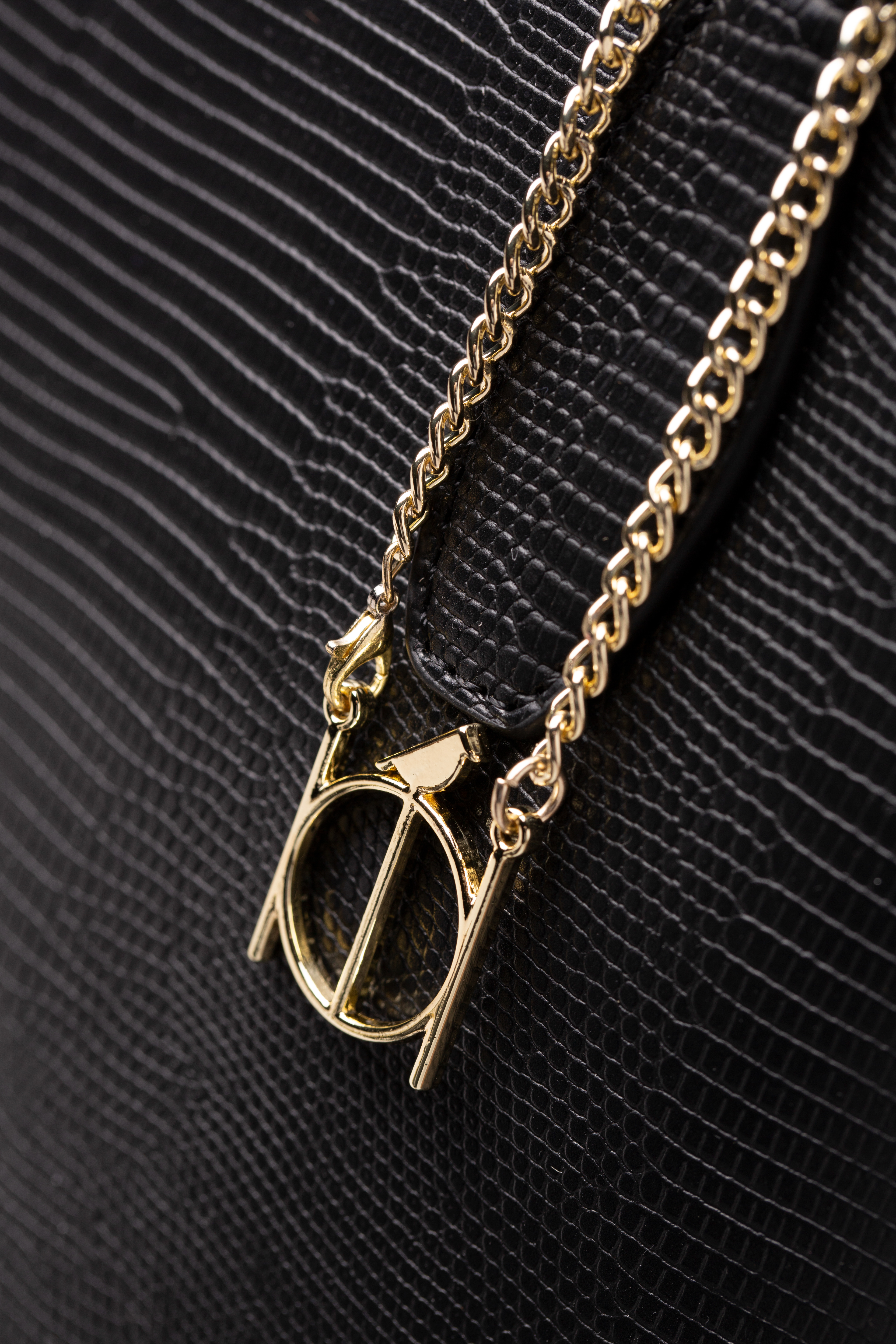
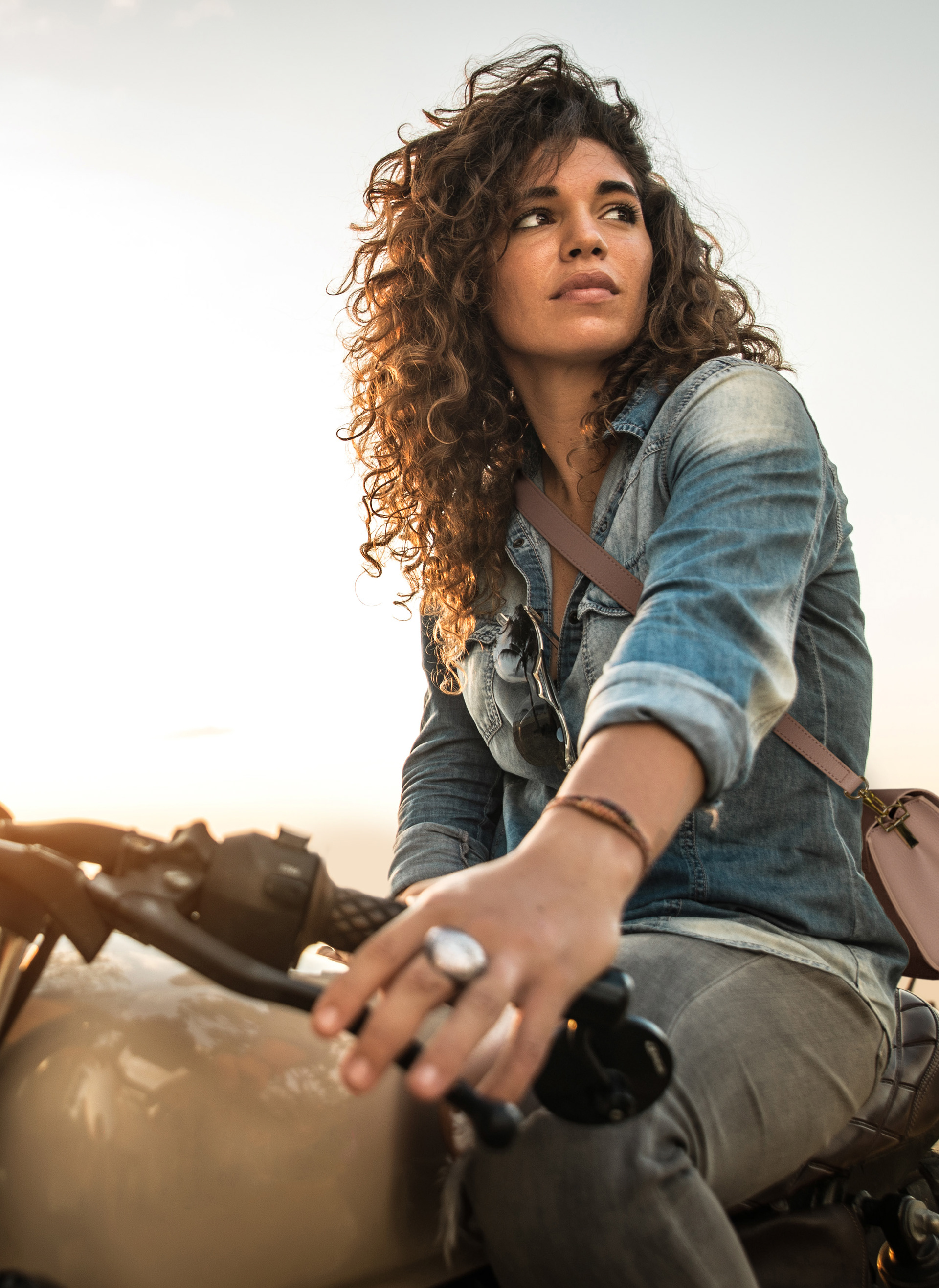
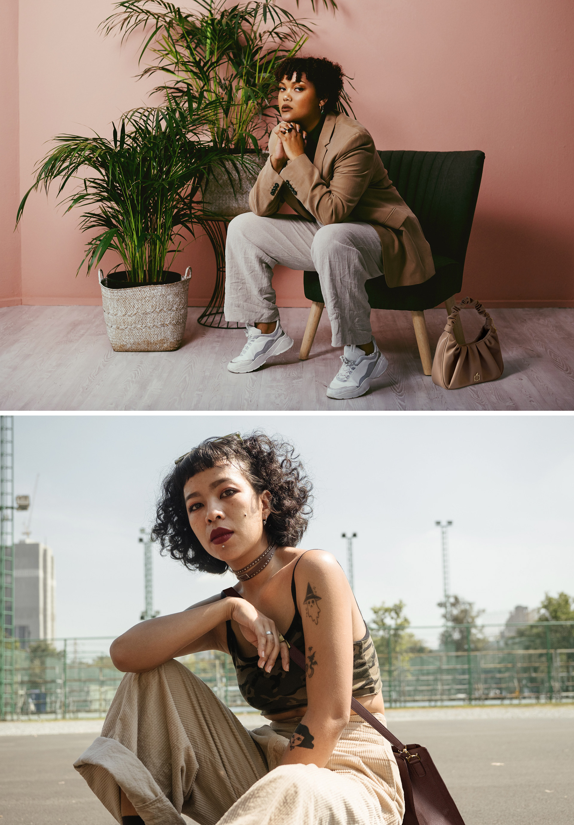
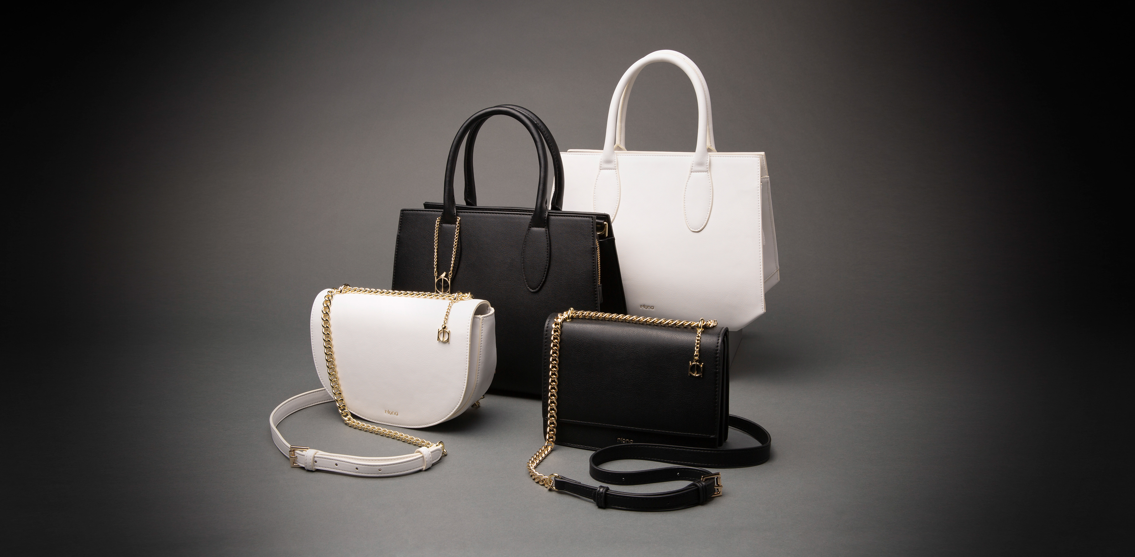
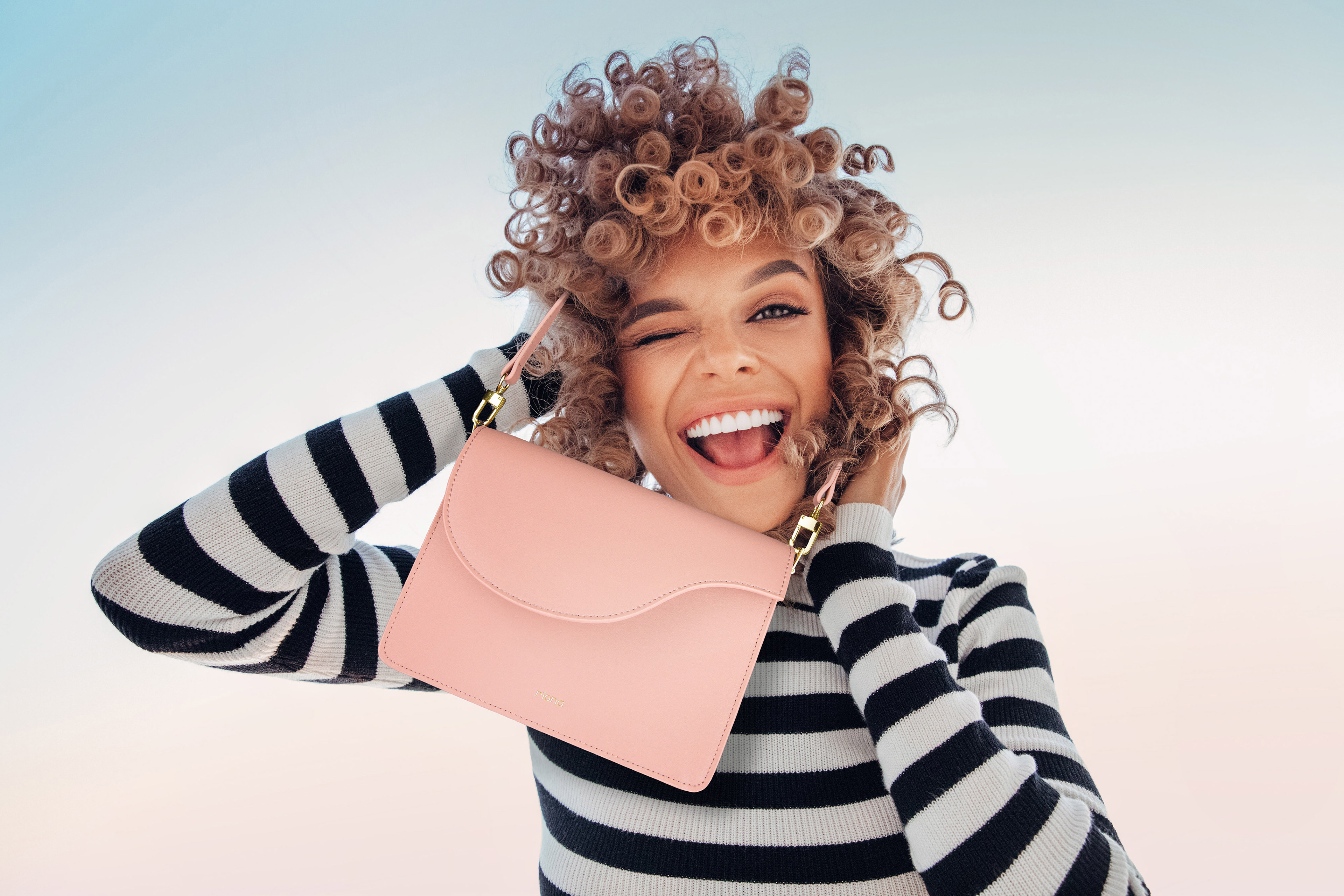
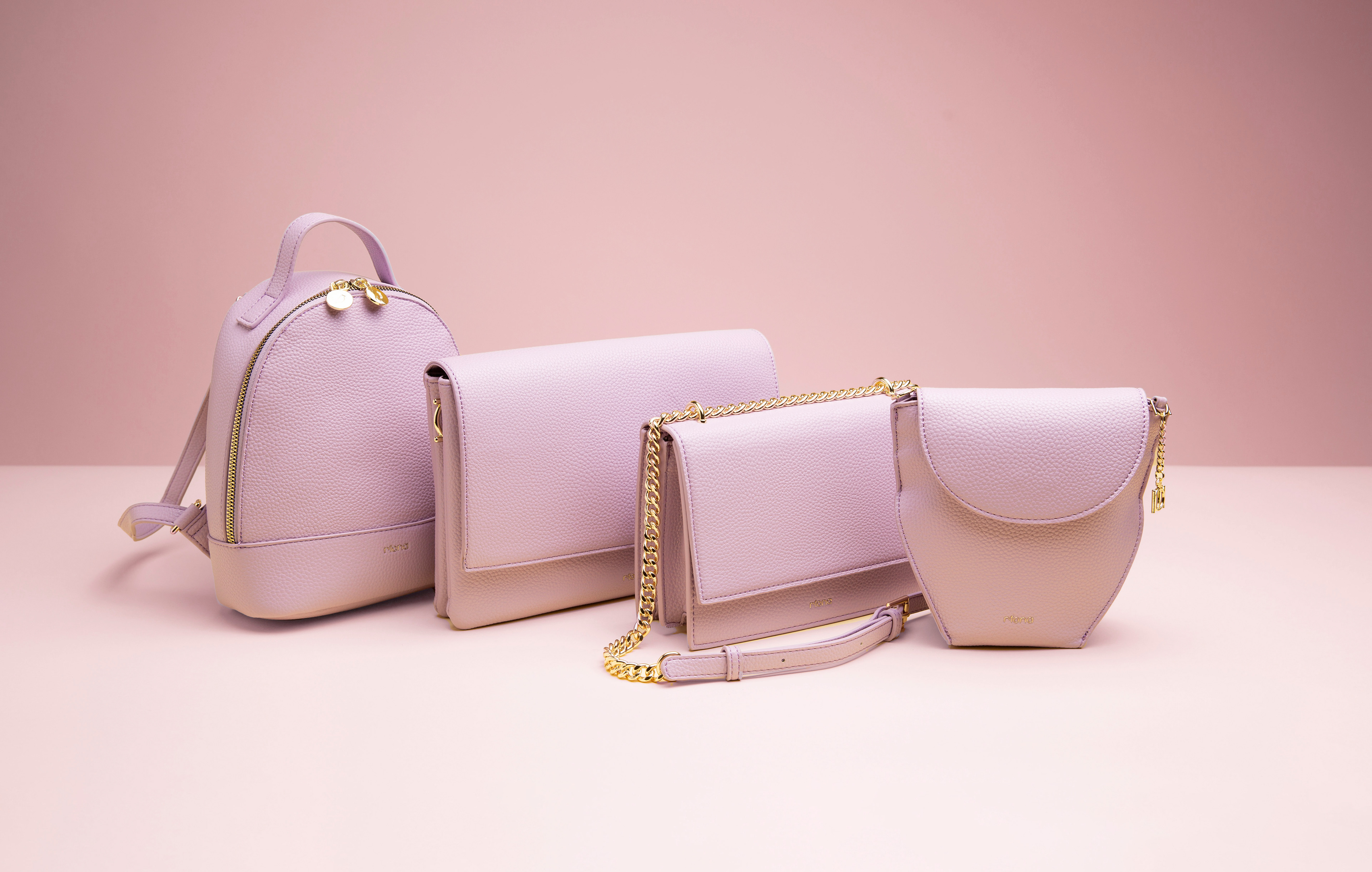
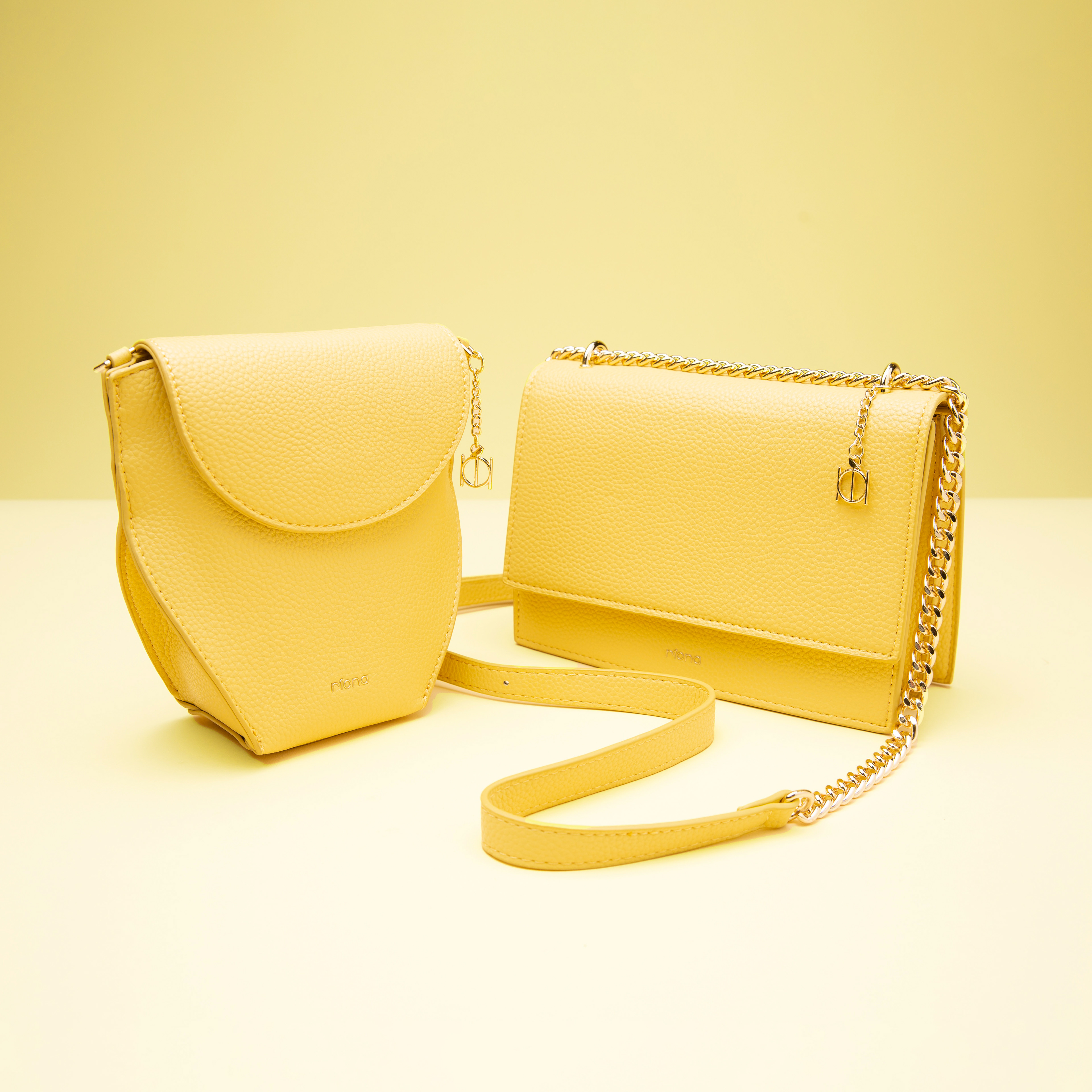
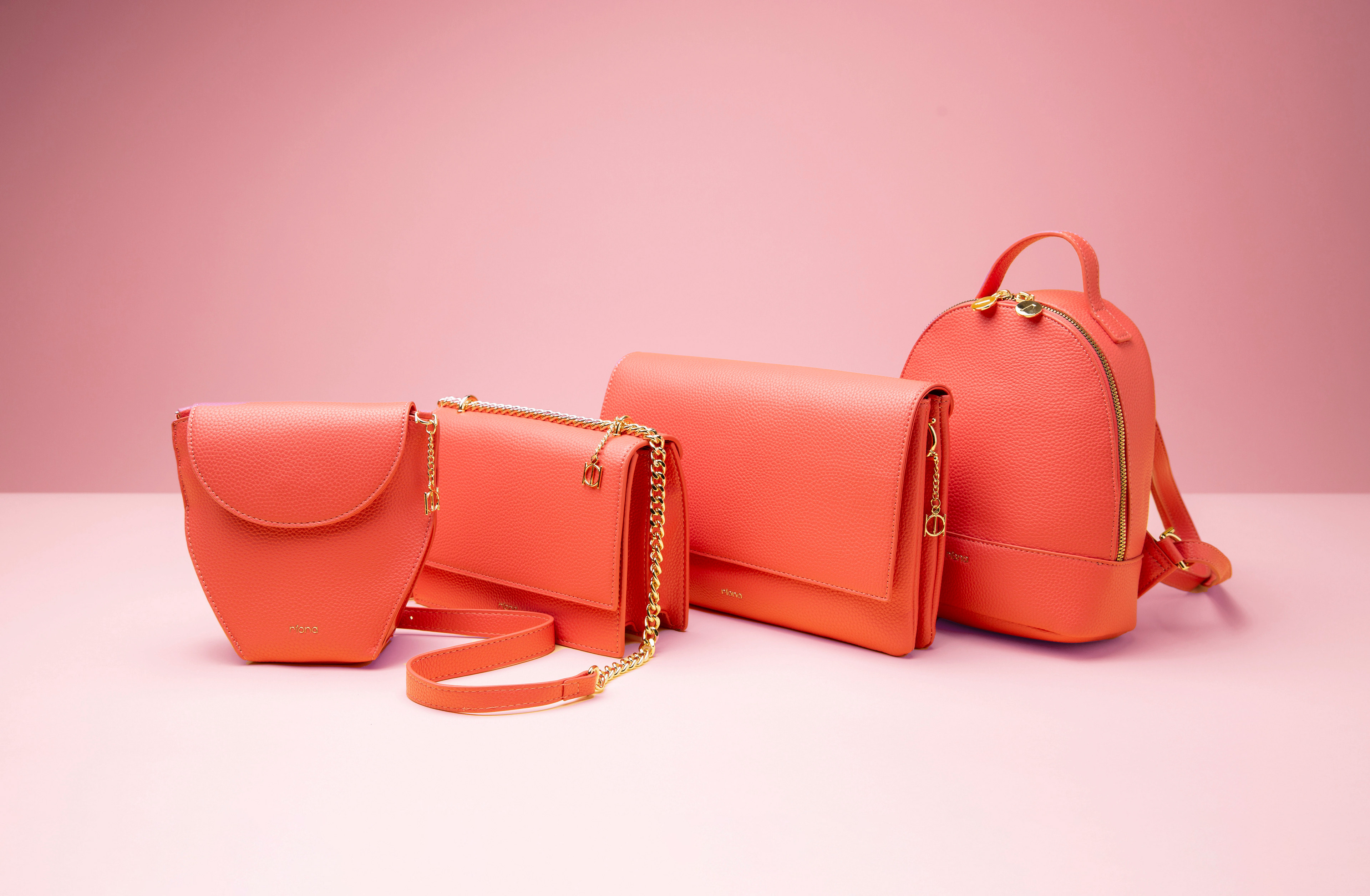
Pour Riona, j’ai créé la marque de sacs à main from scratch, avec l’envie de trouver le juste équilibre entre féminité, force et assurance, sans jamais tomber dans la démonstration. Du logo à l’ensemble du branding, j’ai construit une identité qui raconte cette femme qui s’affranchit de ses limites — comme un oiseau qui s’échappe de sa cage — libre, assumée et élégante.
For Riona, I built the handbag brand from scratch, looking for the right balance between femininity, strength and confidence, without ever becoming overly explicit. From the logo to the overall branding, I created an identity around the story of a woman breaking free from her limits — like a bird escaping its cage — confident, independent and effortlessly elegant.
Direction artistique et Design graphique / Art Direction & Graphic design — Eric Trumpf
Photographie / Photography — Paul Stewart
Photographie / Photography — Paul Stewart

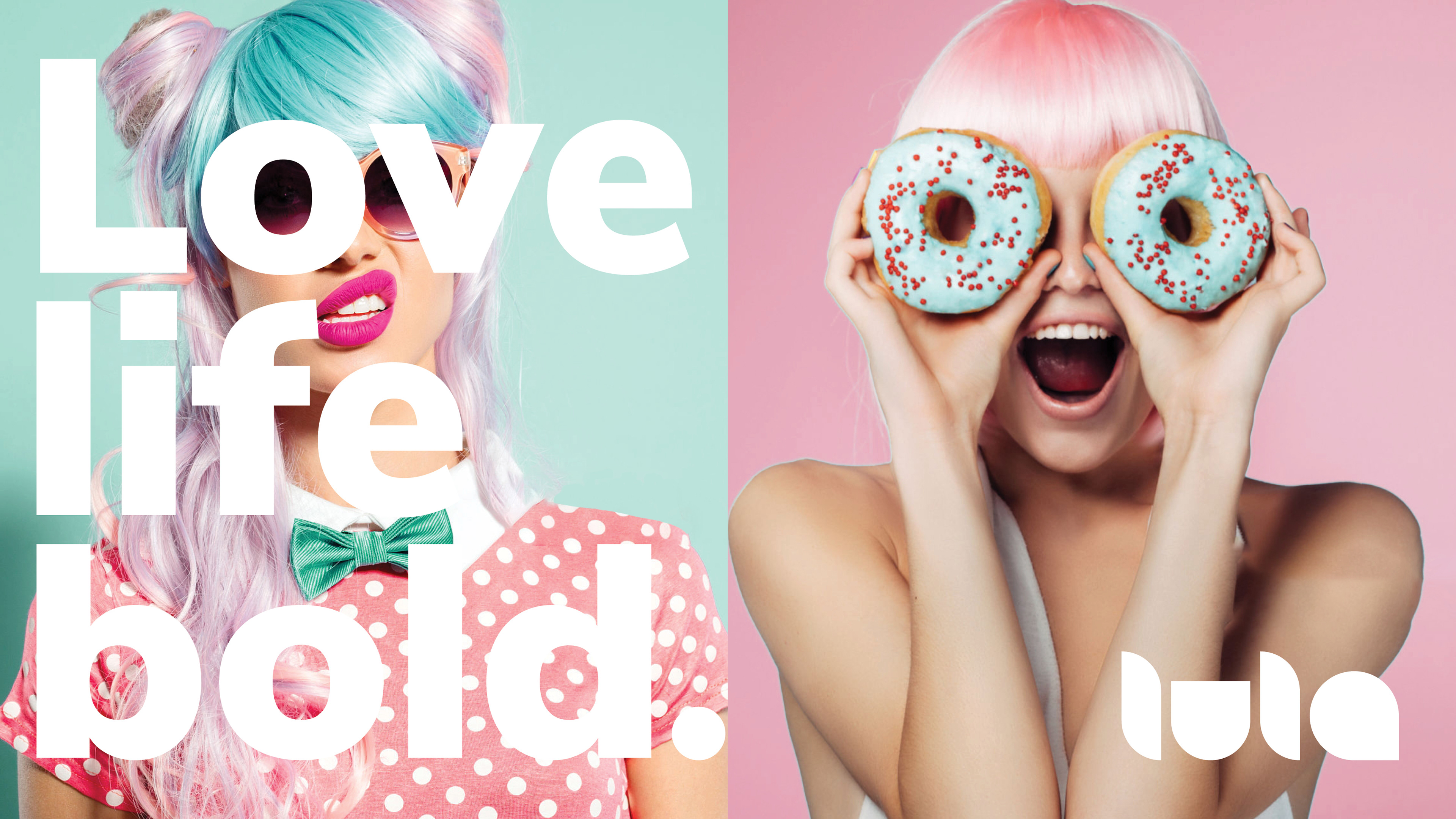
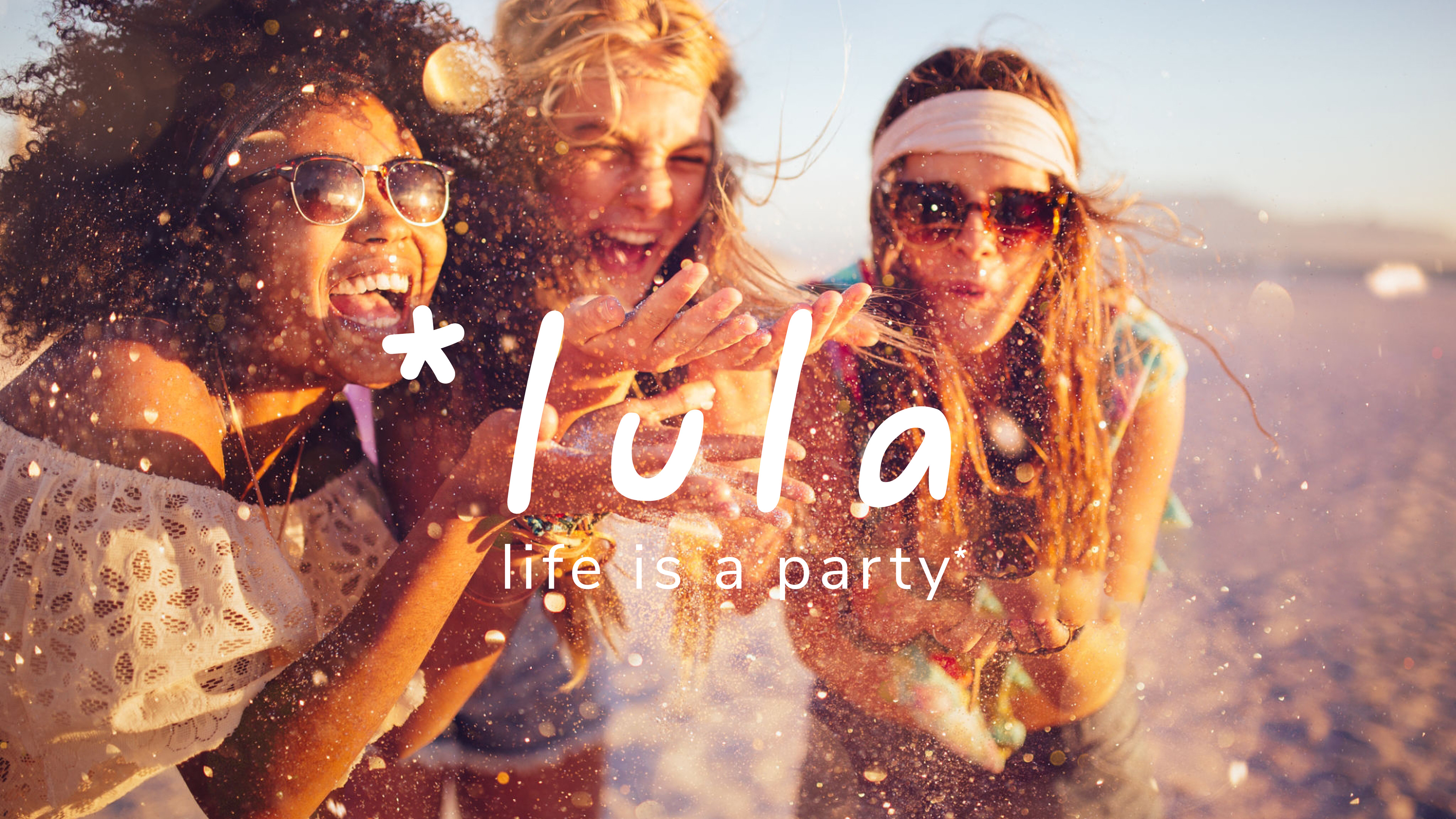
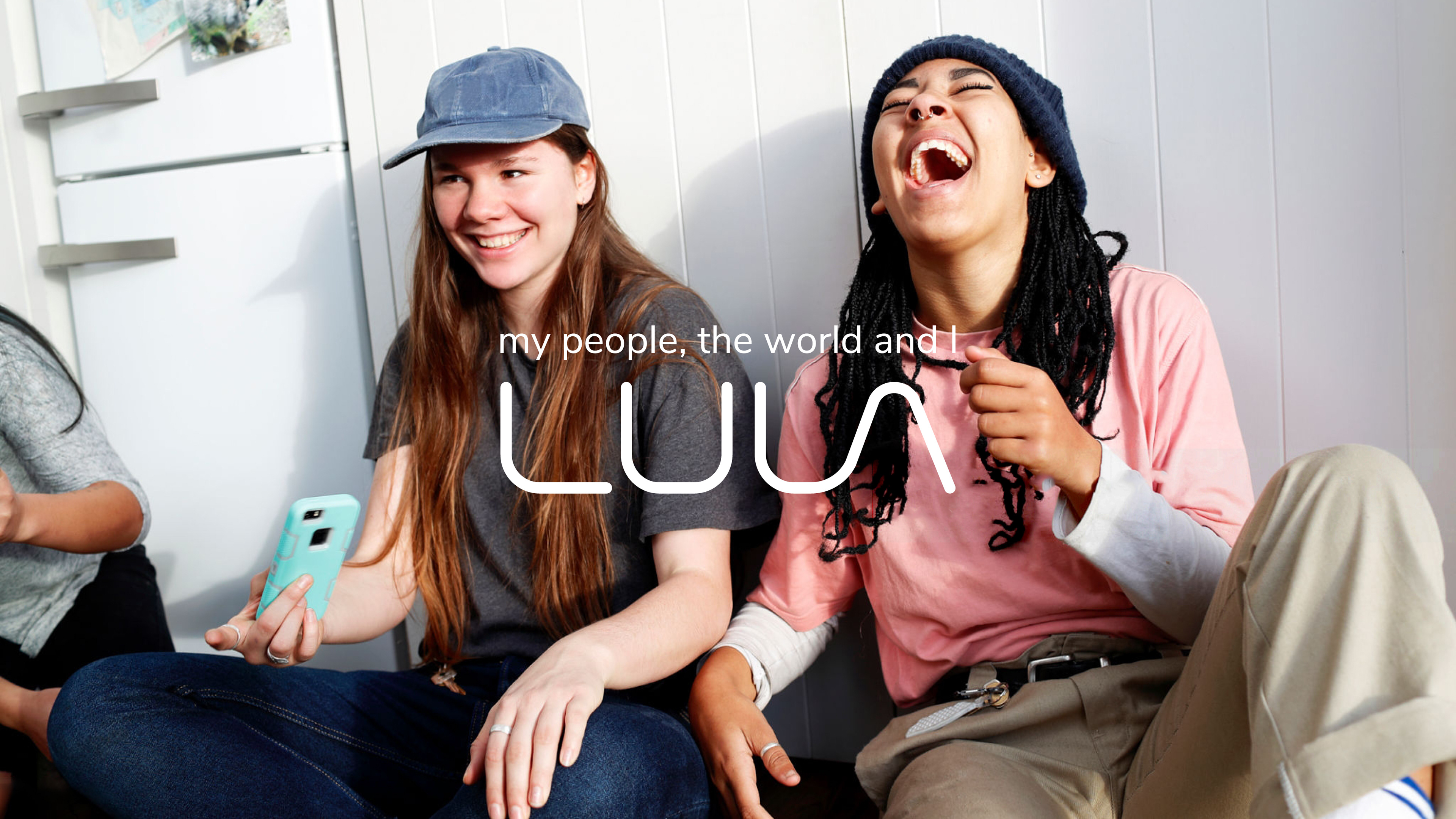
Pour le rebranding de Lula, une marque destinée aux jeunes filles, le mandat était de dépoussiérer son image et de la projeter dans un univers plus actuel. J’ai développé trois directions créatives distinctes, chacune présentée sur un one-pager, pour explorer différentes façons de faire évoluer la marque. La seconde proposition a finalement été retenue.
For Lula’s rebranding, the goal was to refresh the image of this girls’ brand and bring it into a more contemporary world. I developed three distinct creative directions, each presented on a one-page concept board, exploring different ways to evolve the brand. The second direction was ultimately selected.
Direction artistique et Design graphique / Art Direction & Graphic design — Eric Trumpf


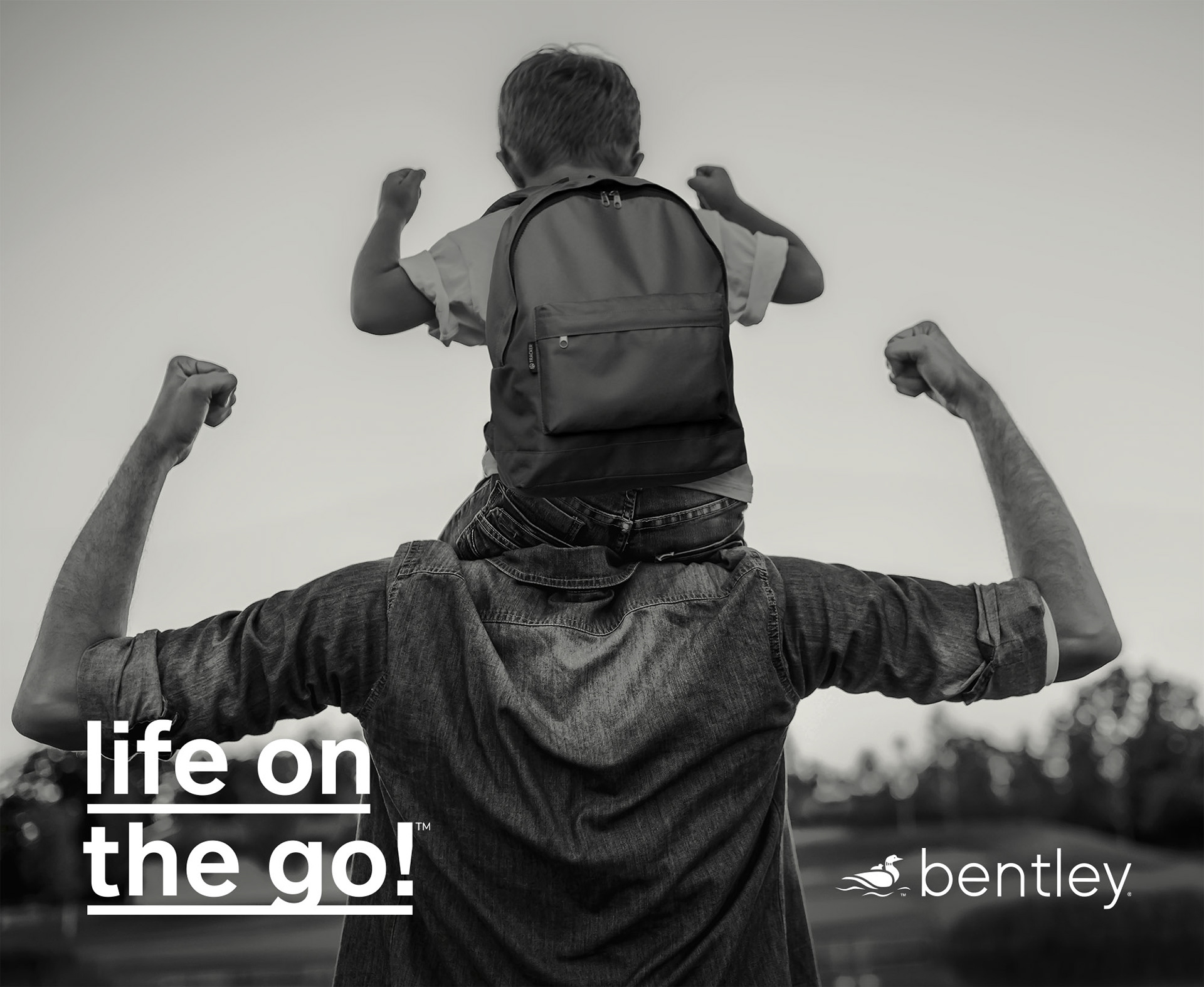
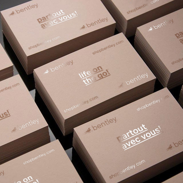
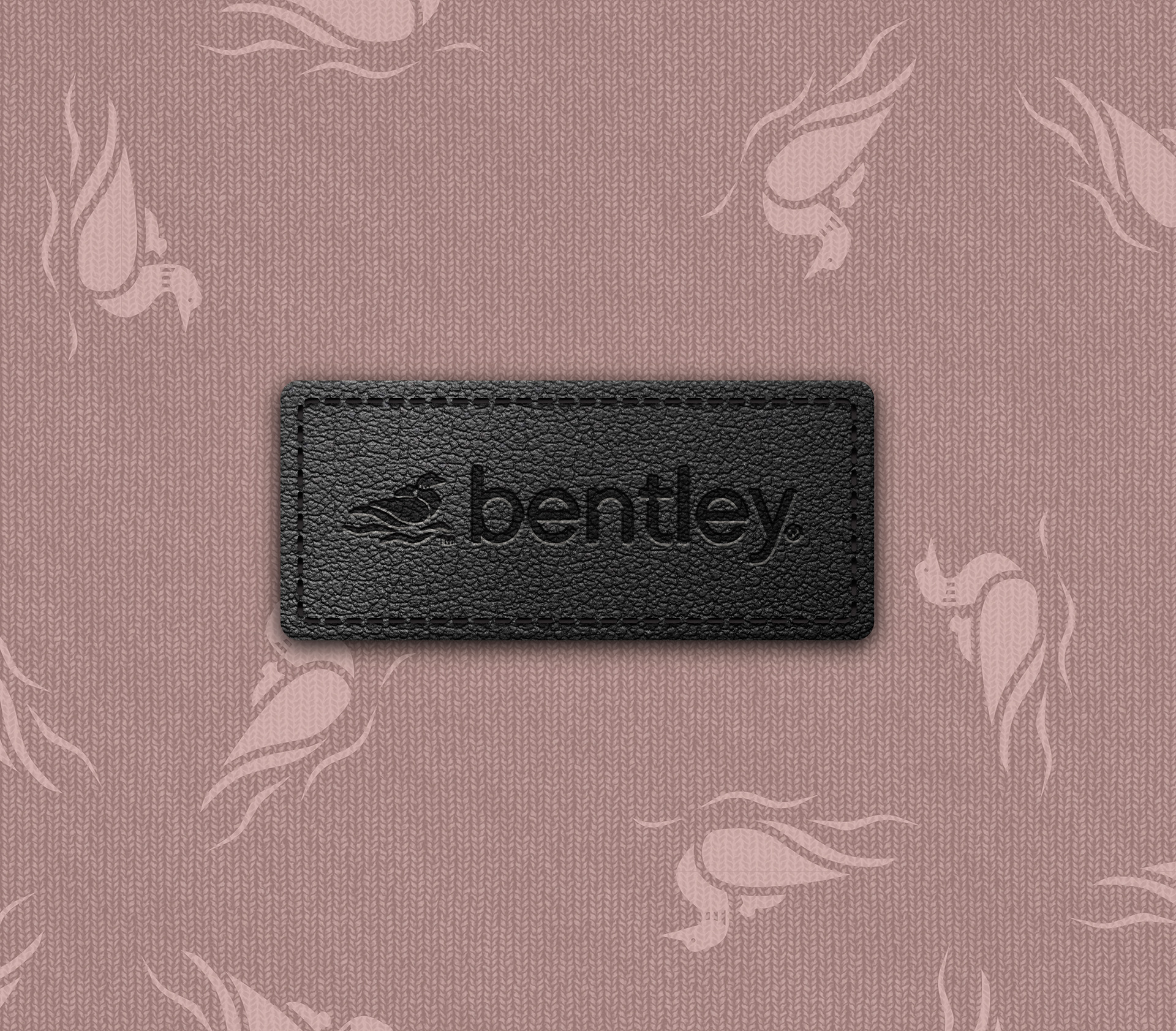
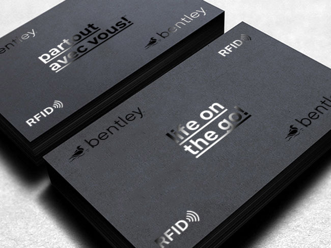
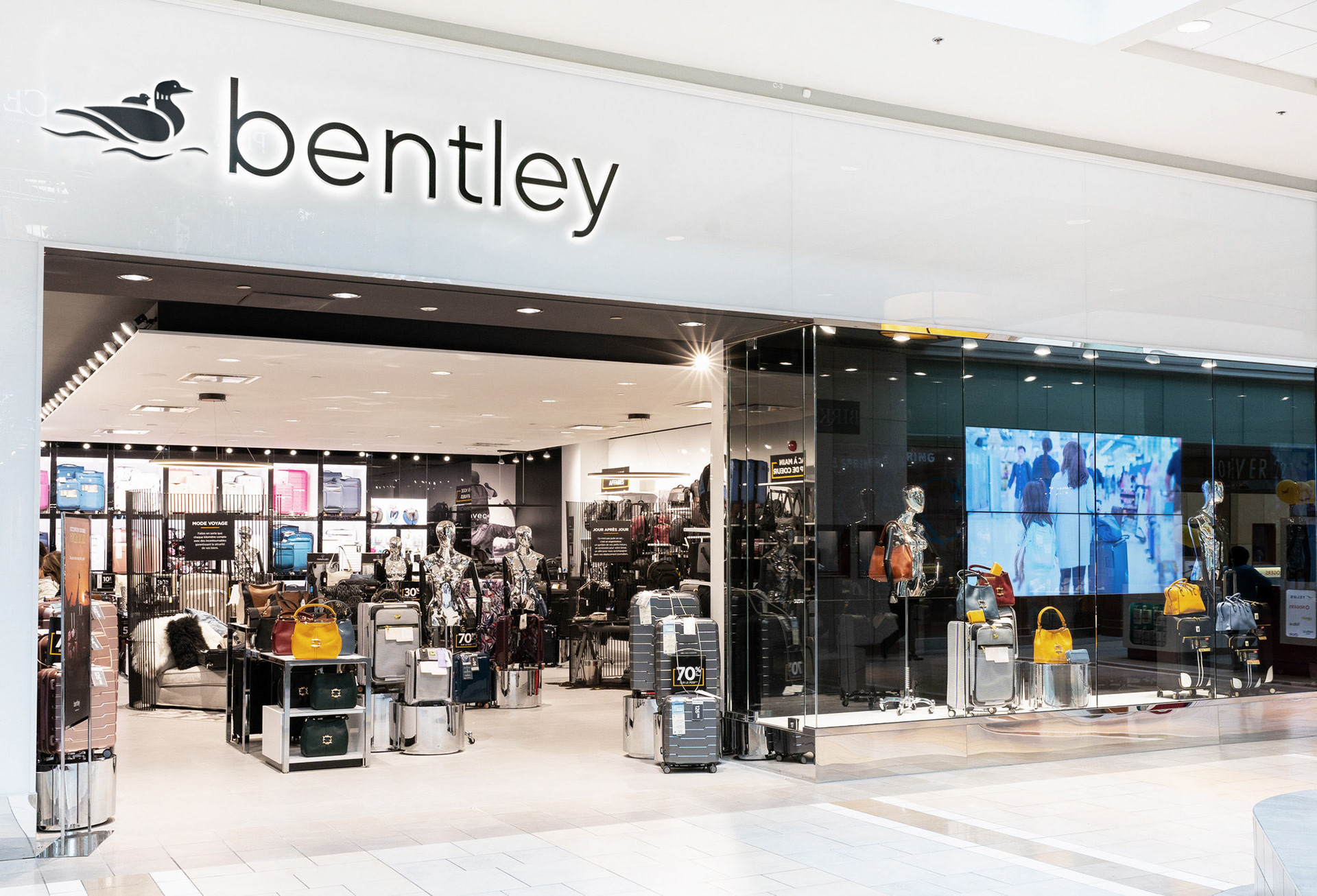
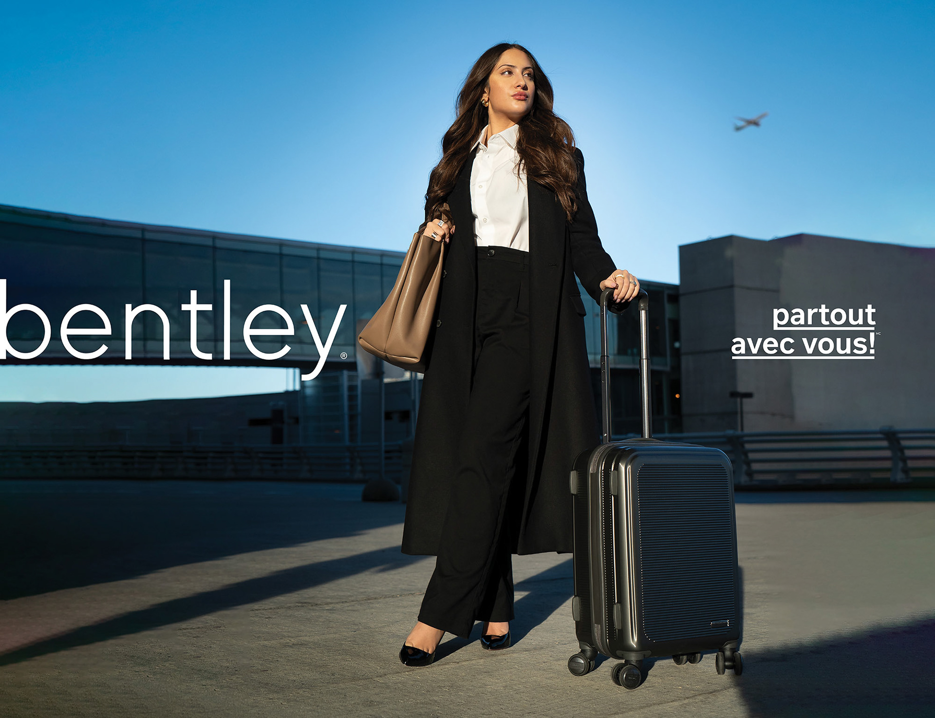
Pour le rebranding de Bentley, le mandat était clair : moderniser, simplifier et faire monter la marque en gamme, tout en préservant certains éléments de son histoire. J’ai donc développé une nouvelle identité et un système de logos à deux niveaux : une version épurée et une version intégrant l’outarde, symbole du Québec et du voyage, permettant à la marque de conserver ce lien à ses origines tout en gagnant en modernité.
For Bentley’s rebranding, the brief was clear: modernize, simplify and elevate the brand while preserving key elements of its heritage. I developed a new identity and a two-tier logo system: a streamlined version and one featuring the Canada goose, a symbol of Québec and travel, allowing the brand to retain a connection to its roots while moving forward with a more contemporary presence.
Direction artistique et Design graphique / Art Direction & Graphic design — Eric Trumpf
Photographie / Photography — Paul Stewart
Photographie / Photography — Paul Stewart


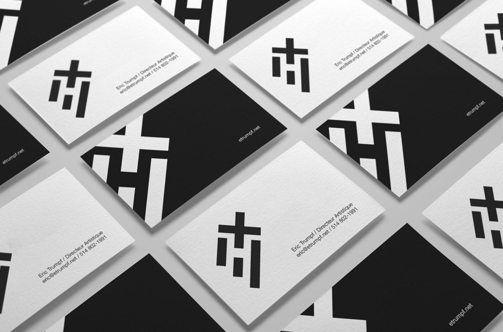
Pour mon branding personnel, je voulais une identité simple, intemporelle et suffisamment forte pour me représenter sans jamais prendre le dessus sur mon travail. Une direction artistique volontairement sobre, pensée comme un écrin pour mes projets et pour laisser la création occuper toute la place.
For my personal branding, I wanted an identity that was simple, timeless and strong enough to represent me without ever overshadowing my work. A deliberately restrained art direction, designed as a backdrop for my projects and to let the creative work take center stage.
Direction artistique et Design graphique / Art Direction & Graphic design — Eric Trumpf



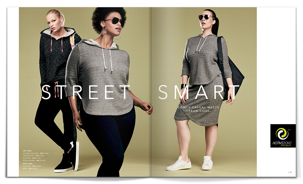
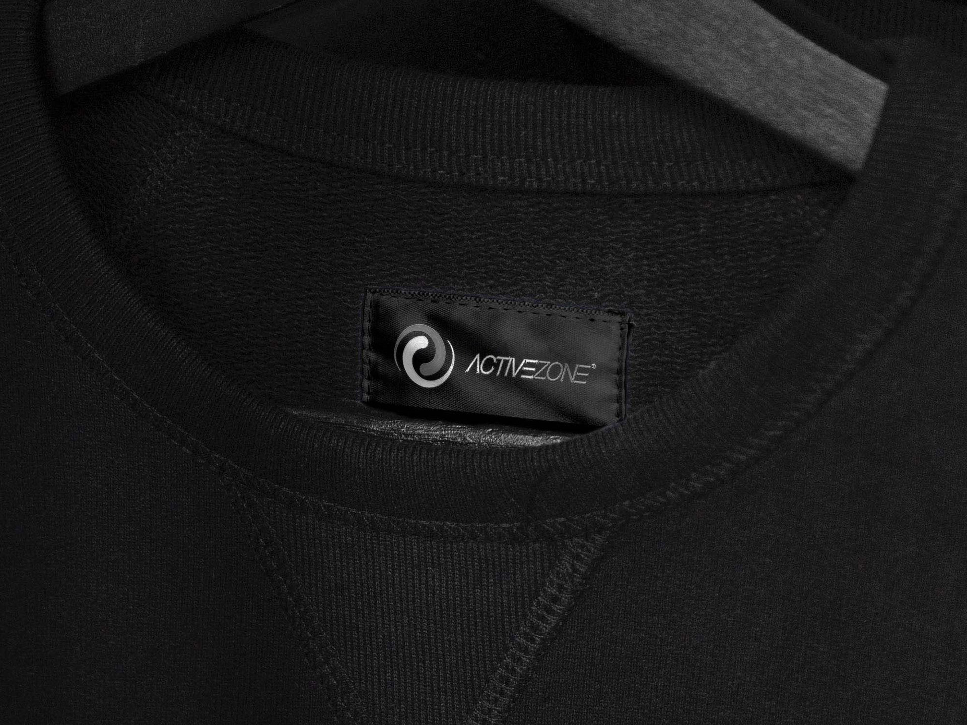
Pour le rebranding d’ActiveZone, l’objectif était de moderniser la marque sans perdre ce qui faisait sa reconnaissance. J’ai redessiné et affiné les formes du logo existant pour lui donner une expression plus actuelle, puis développé une nouvelle identité et une segmentation de marque plus claires et cohérentes.
For ActiveZone’s rebranding, the goal was to modernize the brand without losing what made it recognizable. I redrew and refined the existing logo to give it a more contemporary expression, then developed a new identity and clearer, more cohesive brand segmentation.
Direction artistique et Design graphique / Art Direction & Graphic design — Eric Trumpf

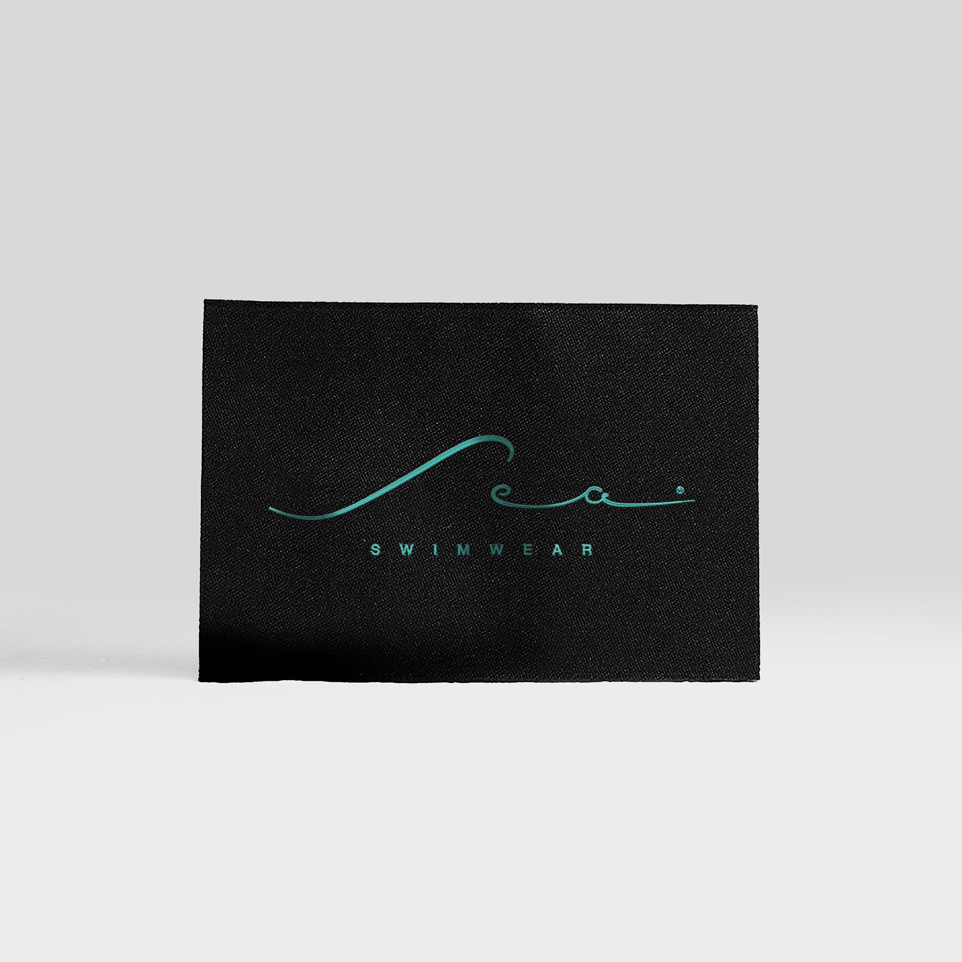
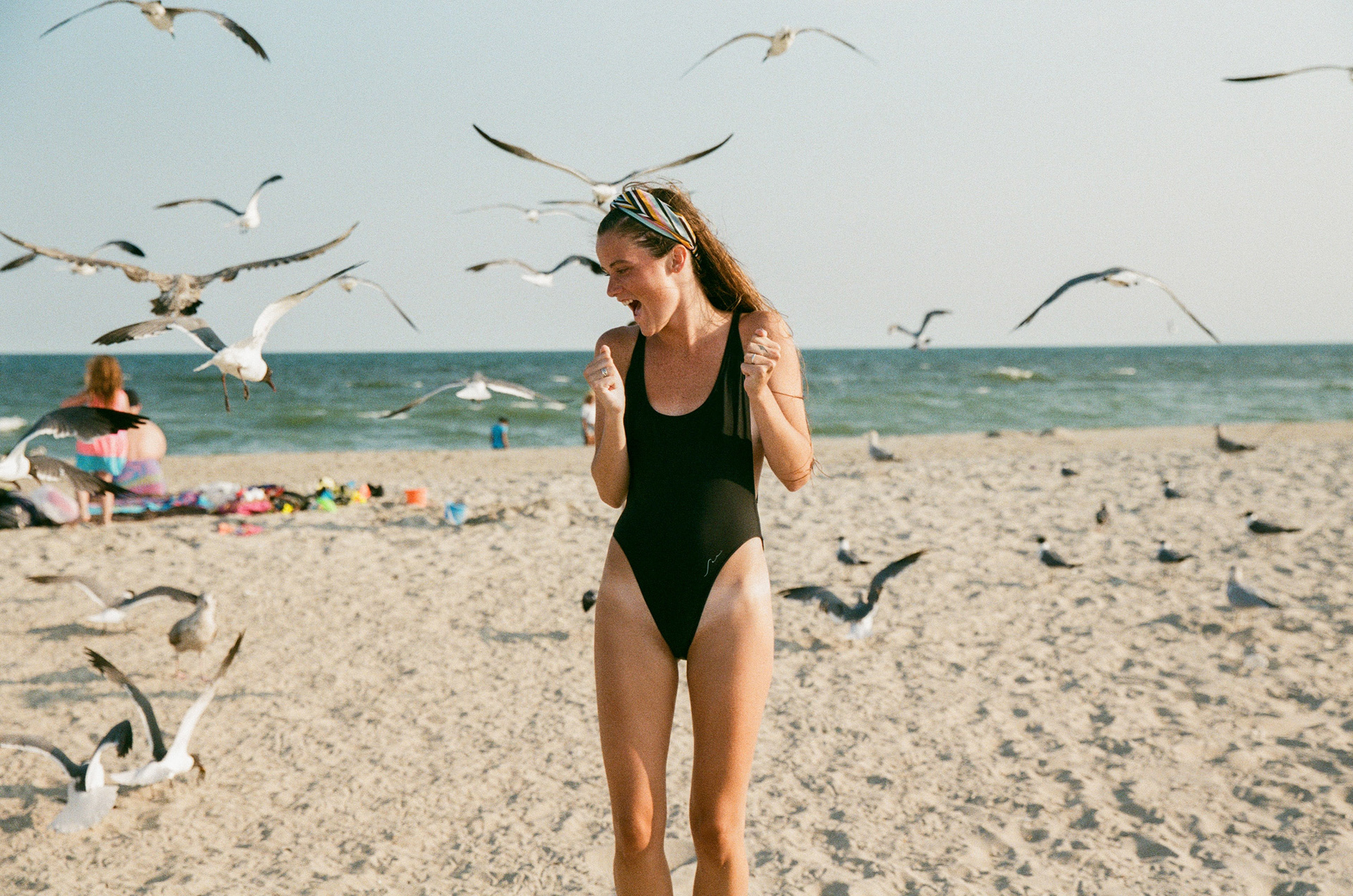
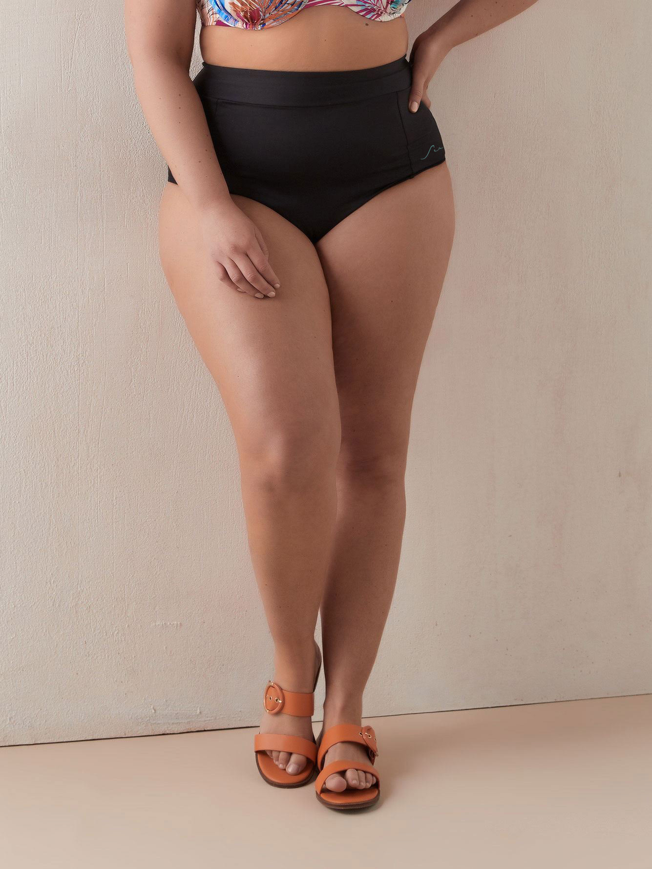
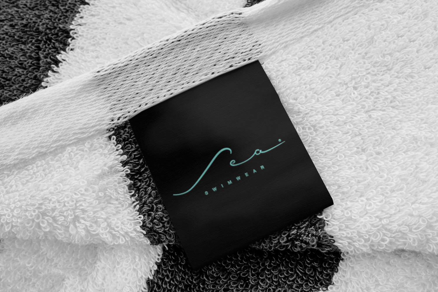
Pour Sea, la marque de maillots de bain d’Additionnelle, j’ai conçu un logo qui devait traduire l’univers de la marque avec simplicité et élégance. Une identité pensée pour être à la fois distinctive, féminine et suffisamment intemporelle pour accompagner la collection.
For Sea, Additionnelle’s swimwear brand, I designed a logo that captures the brand’s world through simplicity and elegance. An identity created to feel distinctive, feminine and timeless enough to grow with the collection.
Design graphique / Graphic design — Eric Trumpf

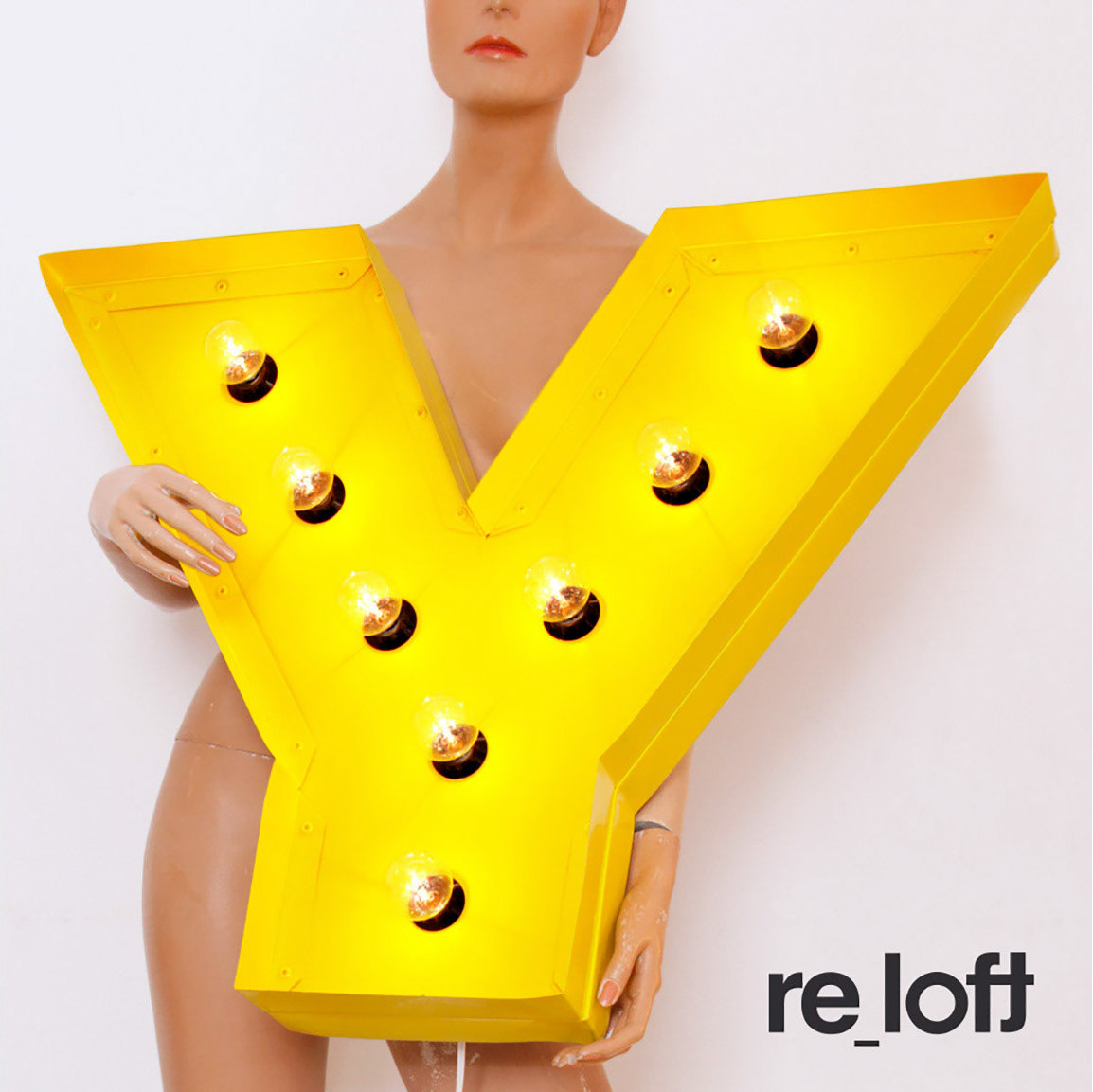
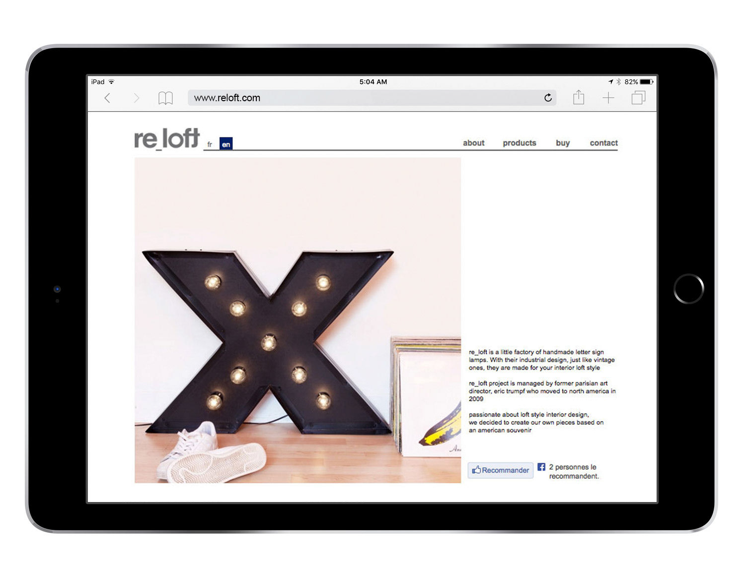
Projet personnel / Personal project

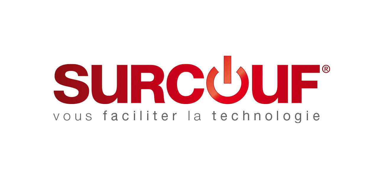
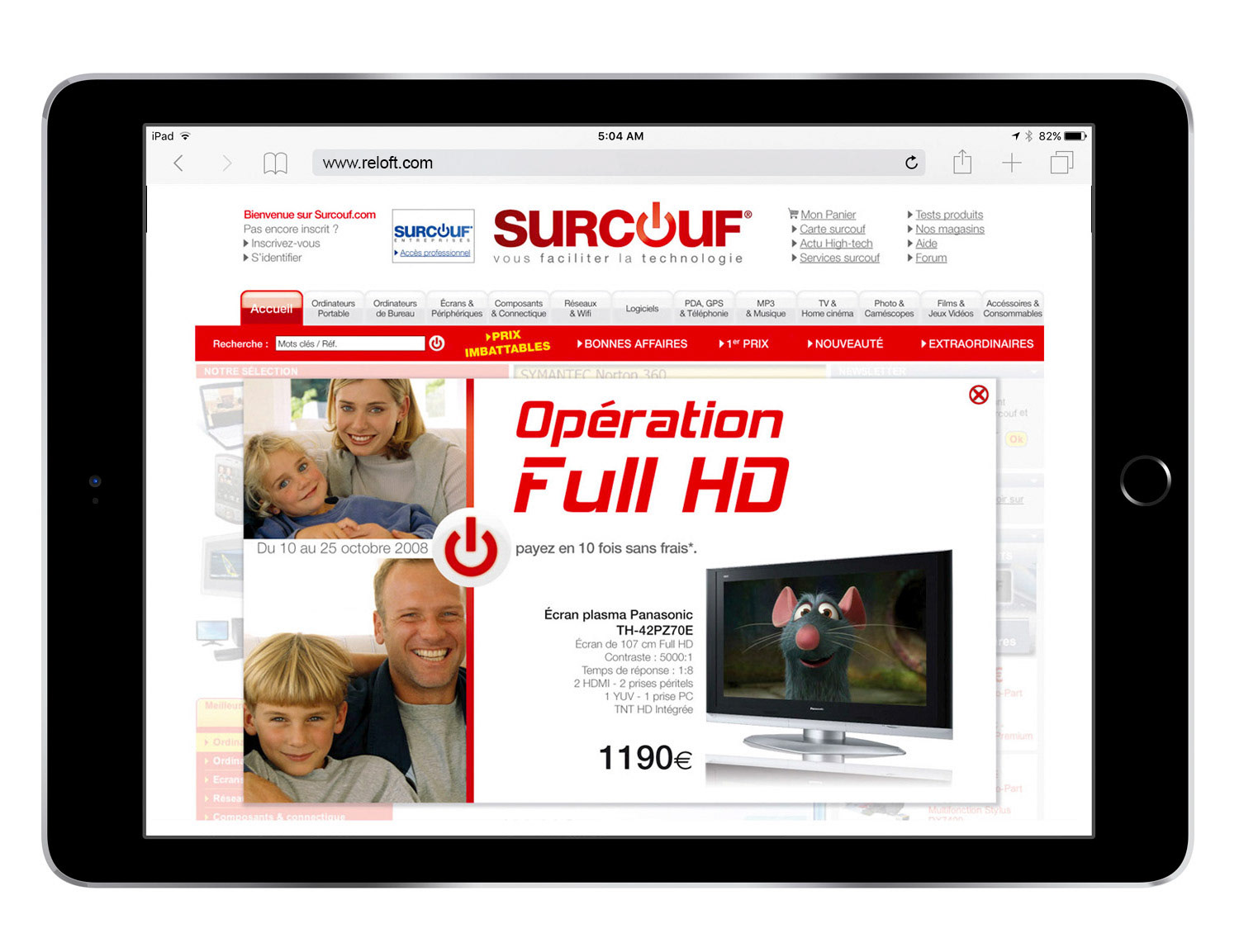
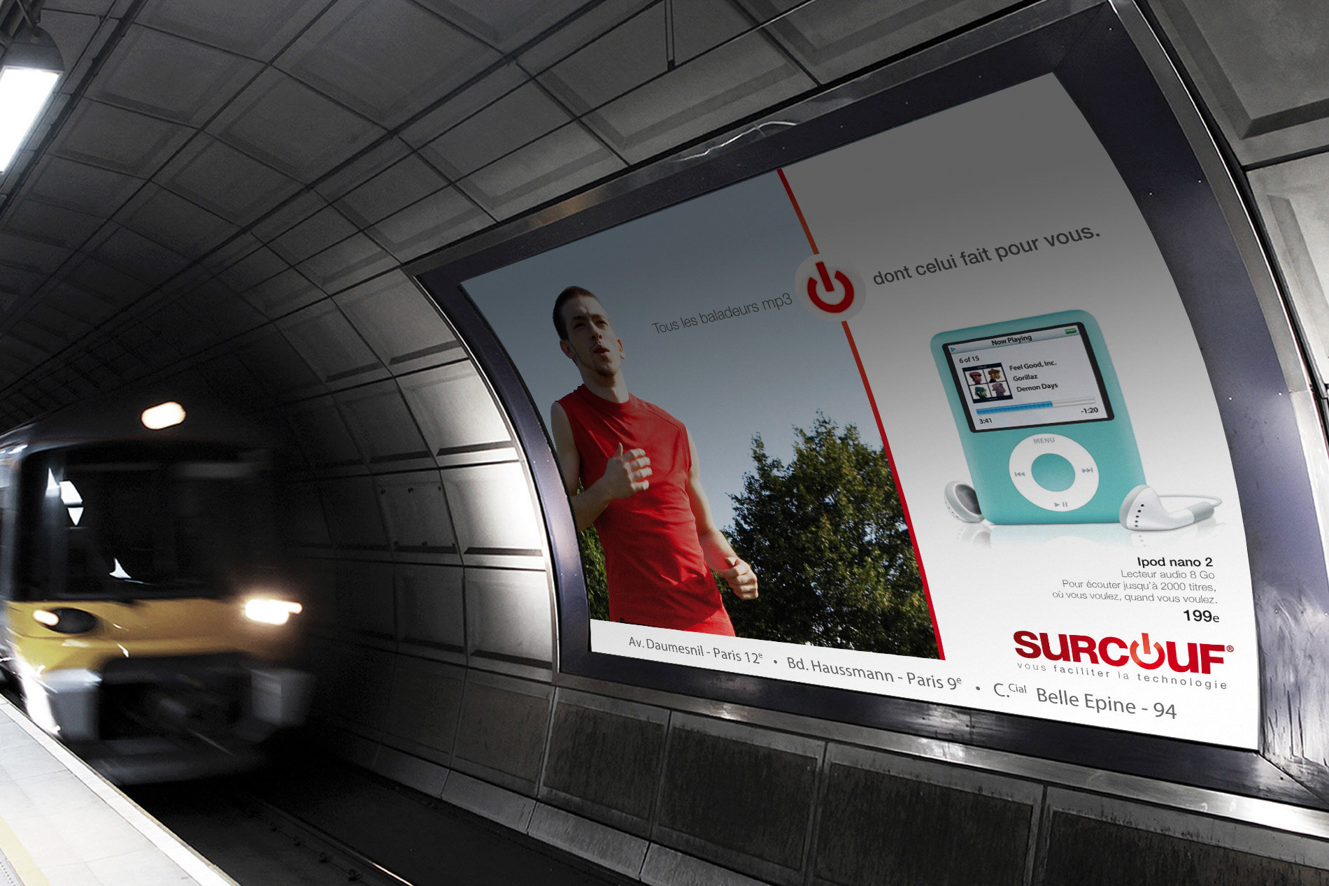
Dans le cadre de l’appel d’offres de Surcouf, nous avons imaginé plusieurs territoires de rebranding, dont le concept du « Facilitateur techno ». L’idée était de positionner Surcouf comme celui qui transforme la technologie en solutions simples et concrètes, avec le bouton « ON » comme expression visuelle d’une marque qui aide à faire avancer les choses.
As part of Surcouf’s rebranding pitch, we developed several brand territories, including the “Tech Facilitator” concept. The idea was to position Surcouf as the brand that turns technology into simple, practical solutions, with the “ON” button as the visual expression of a brand that helps make things happen.
Direction artistique et Design graphique / Art Direction & Graphic design — Eric Trumpf